Denim-Look Leggings and the Back Pocket Problem
Quick Answer: Back pockets on denim-look leggings either work or expose the whole illusion, and it comes down to three things: pocket placement relative to your seat, whether the pocket is functional or printed, and how the pocket fabric behaves when the base fabric stretches. Placed too low or too far apart, they flatten and widen; printed rather than sewn, they distort visibly when the fabric stretches.
On real denim the pocket sits on a non-stretch surface. On a legging it does not, and that difference drives everything.
Why do pocket placement rules change on stretch fabric?
Because the pocket and the fabric under it move at different rates.
On rigid denim, a back pocket sits on a surface that changes shape very little. The designer places it once and it stays where it was placed.
On a stretch legging, the base fabric can elongate by 30 to 60 percent depending on the knit. A sewn-on pocket made from a less stretchy fabric acts as a stabilized patch - the fabric around it stretches, the pocket does not, and the boundary between them becomes visible as a slight pucker or a change in the surface tension.
That effect is small when the legging fits well. It becomes obvious when the legging is under tension - a size too small, or across the widest part of the seat.
The placement consequence: a pocket that is correctly placed on the hanger may not be correctly placed on a body, because the fabric it is attached to has moved. Pockets tend to migrate outward and downward when the legging stretches across the seat, which is exactly the direction that reads as unflattering.
This is why the same pocket design looks fine in one size and wrong in another on the same person.
What placement actually looks right?
The same principles as denim, applied one size more conservatively.
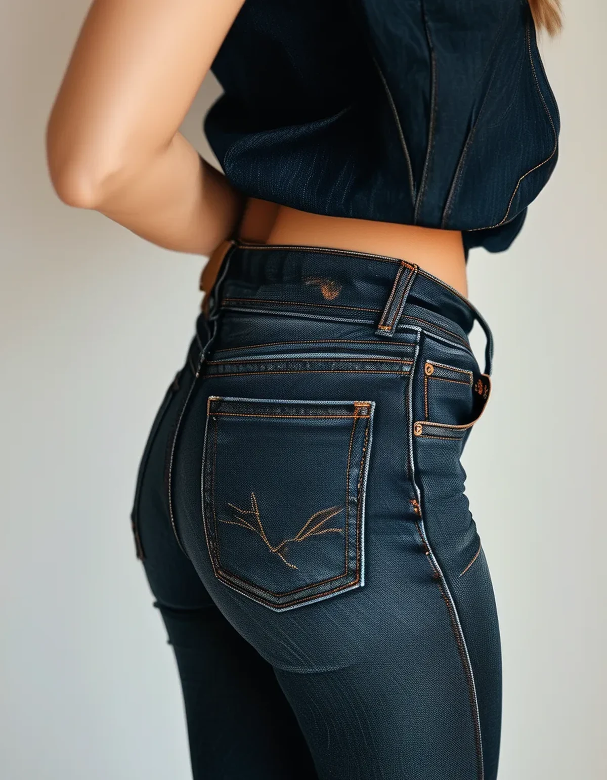
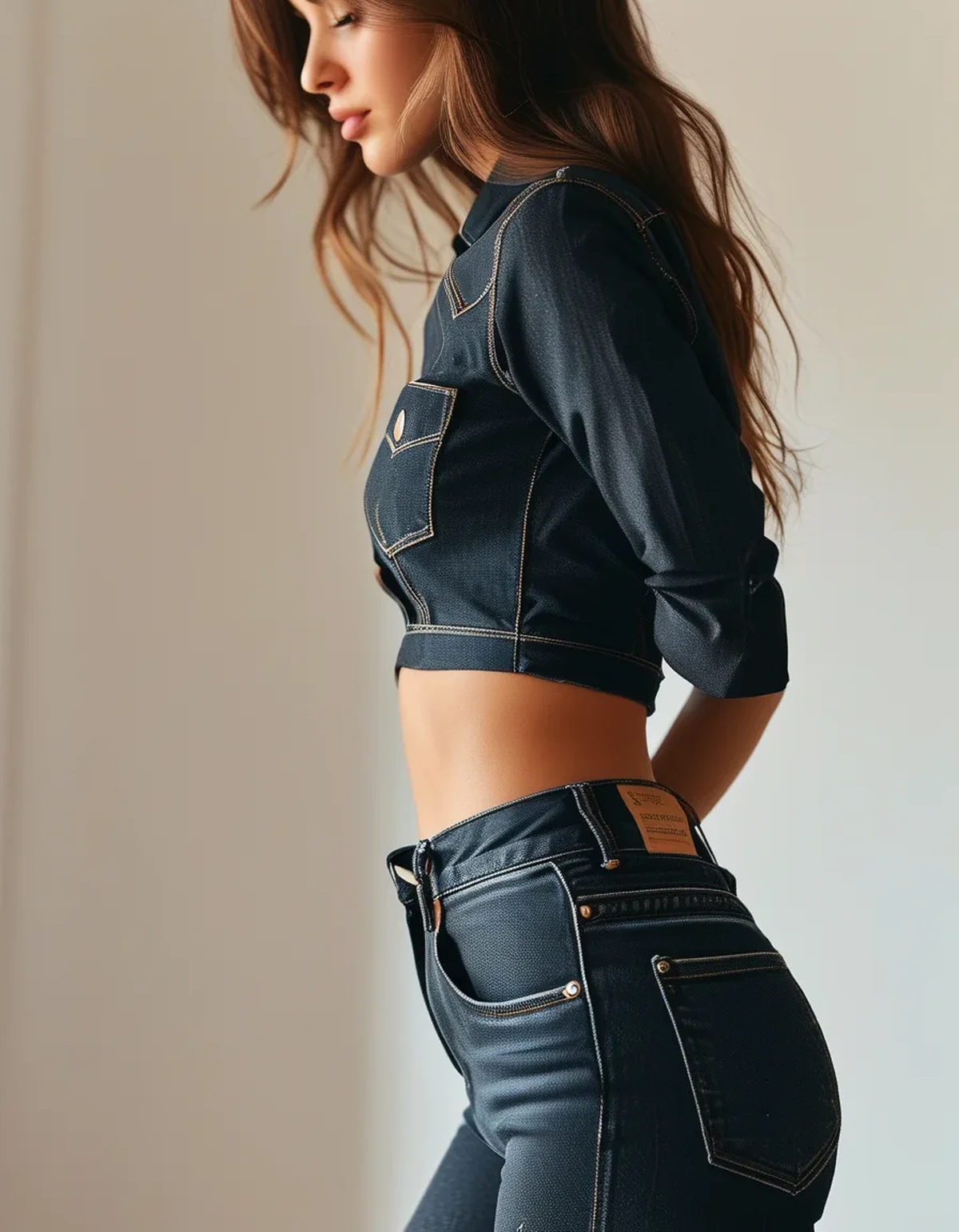
Vertical position: the top edge of the pocket should sit at or slightly below the fullest part of the seat, not above it and not near the bottom. Pockets sitting low visually lengthen the seat and shorten the leg. On a legging, since the fabric stretches downward under load, placement should start slightly higher than it would on denim to end up in the right place when worn.
Horizontal spacing: closer together reads narrower; wider apart reads broader. The gap between the two pockets should be roughly the width of one pocket or slightly less. Wide gaps are the most common design mistake in this category.
Size: larger pockets make the seat look smaller by proportion. Small pockets do the opposite. This is the single most reliable rule carried over from denim and it holds completely on leggings.
Angle: a slight inward tilt at the bottom is more flattering than perfectly square, because it follows the body’s line.
When shopping, the useful check is to try them and look in a mirror from a three-quarter angle rather than straight on. Straight-on hides placement issues that are immediately visible from 45 degrees.
Printed pockets versus sewn pockets - which is better?
Sewn, almost always, and the reason is what happens under stretch.
Printed pockets are part of the fabric surface, so they stretch with it. That sounds like an advantage and it is the opposite. When the fabric elongates 40 percent across the seat, a printed pocket elongates with it and becomes visibly distorted - wider, shallower, and with the stitching lines spread apart. The eye reads the distortion instantly because pocket proportions are extremely familiar.
Printed pockets also cannot cast a shadow. On real denim, the pocket edge creates a slight raised line and a shadow, which is a large part of what makes it read as a pocket at a glance.
Sewn pockets hold their shape and create real edges. They add a small amount of bulk, which most people find worth it. The main risk is the puckering at the boundary discussed above, which good construction minimizes by using a pocket fabric with some stretch of its own - typically the same knit rather than a woven.
A middle option some brands use: a sewn-on pocket with topstitching in a contrast thread and no actual pocket bag. You get the edge and the shadow without the bulk. This works well and is worth looking for.
The quick in-store test: stretch the fabric across the pocket with both hands. If the pocket distorts noticeably, it will do the same on your body.
Myth vs Fact: Denim-Look Legging Details
Myth: Functional pockets are always better than decorative ones.
Fact: A functional back pocket on a legging is rarely usable - anything you put in it presses against you when you sit and creates a visible bulge. The value of the pocket here is entirely visual. A well-executed decorative pocket beats a poorly executed functional one.
Myth: The fly detail is what gives them away.
Fact: It is usually the waistband. A denim-look legging with an elastic waistband and no button reads as a legging from across a room regardless of how good the fly detail is. Brands that add a faux button and a proper waistband facing get considerably closer.
Myth: Darker washes always look more like real denim.
Fact: Darker washes hide fabric sheen better, which is the real advantage. But fading and whiskering detail is what reads as denim, and dark uniform colors have less of it. A mid-wash with subtle fade detail often reads more convincingly than a flat dark one.
Myth: Real denim texture cannot be replicated in a knit.
Fact: It can be approached surprisingly closely with a yarn-dyed jacquard knit rather than a print. These cost more and are worth handling in person to see the difference - the texture is in the fabric structure rather than on its surface.
FAQ: Denim-Look Legging Questions, Answered
Do the pockets add bulk where I do not want it?
A sewn pocket adds one or two layers of fabric, which is a small amount of visual volume. Whether that matters depends on placement more than thickness - correctly placed pockets add structure that most people find flattering.
Why does one pocket look higher than the other?
Usually normal asymmetry in the body rather than the garment, made visible by the pocket giving you a reference line. Occasionally it is a construction issue, which you can check by laying the legging flat and comparing.
Can pockets be removed?
Sewn-on pockets can be unpicked, but they almost always leave visible needle holes and a color difference where the fabric underneath was protected from washing and light. Not worth attempting on a piece you like.
TL;DR:
- Stretch fabric moves under load, so pockets migrate outward and downward - placement must start slightly higher than on denim.
- Larger pockets, spaced roughly one pocket-width apart, sitting at or just below the fullest part of the seat, is the reliable formula.
- Sewn pockets beat printed ones because printed pockets distort visibly when the fabric elongates.
- The waistband, not the fly, is what usually gives the illusion away.
- Test by stretching the fabric across the pocket in your hands before buying.
Check the fit from a three-quarter angle rather than straight on - that is where placement problems actually show.
See It in Motion
Seen here: High Waist Embossed Yoga Leggings with Side Pockets — shop it on bubblelime.com
Keep Reading
This article is for general informational and styling purposes only. Fit, sizing, and product availability may vary.
