The Five Details That Give Away a Denim-Look Legging
Quick Answer: Denim-look leggings read as real when five details are right: a matte rather than shiny finish, visible but subtle fade variation rather than uniform colour, contrast topstitching that follows real jean seam lines, functional-looking back pockets positioned at the right height, and a waistband that does not look like a stretch band. Printed leggings that fail on finish and pocket placement are the ones that read as costume from across a room.
Some denim-print leggings genuinely pass at conversational distance. Others announce themselves from twenty feet away.
The difference is not price. It is five details you can check on a product photo.
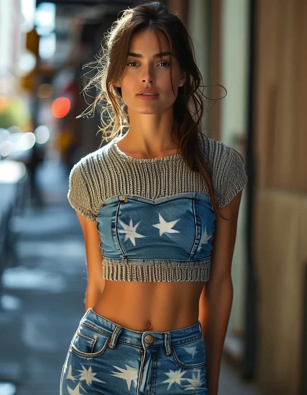
What gives it away first?
The finish, and it is visible before anything else.
Real denim is matte. It is a woven cotton twill with a slightly irregular surface that absorbs light rather than reflecting it. Most performance knits have some degree of sheen because of the fibres and the knit structure.
Sheen is the single biggest tell, and it is worse under artificial light than in daylight. A legging that looks acceptably matte in a shop window can look distinctly plasticky under office lighting.
What to look for: a brushed or peached finish, or a fabric described as matte. Nylon-heavy blends tend to be shinier than polyester-heavy ones, and a small percentage of cotton or viscose in the blend usually improves the hand and reduces sheen.
The second finish issue is surface texture. Denim has a visible diagonal twill line. A flat printed fabric has none, and even a good print looks flat up close because the texture is photographic rather than structural. Some better versions use a jacquard or textured knit that creates actual surface relief, which reads far more convincingly.
How to check from a product photo: look at how light falls across the thigh. A uniform bright highlight running down the leg means sheen. A surface that looks slightly broken up and irregular is closer to real denim.
Why does the fade pattern matter so much?
Because uniform colour is the second-fastest tell.
Real denim fades unevenly and in specific places. Whiskering at the hip crease, fading at the knee, gradual lightening along the thigh, darker at the seams. This is where wear happens, and the eye recognises the pattern without consciously analysing it.
A flat, uniform indigo print reads as fabric printed to look like denim rather than as denim, because real denim in that state only exists brand new and unworn.
What good versions do:
- Subtle gradient shading down the leg
- Slight lightening at the knee
- Darker tone along printed seam lines
What overdone versions do: heavy, high-contrast whiskering and dramatic thigh fading. This is the opposite failure - it reads as a costume approximation of distressed jeans. The fade should be visible only when you look for it.
A useful test on a product photo: look at the knee. If the colour there is identical to the colour at the hip, it will read flat. If there is a subtle lighter area, someone thought about it.
On colour choice generally: darker indigo washes read as more convincing than light ones, because light washes depend more heavily on fade detail and texture to look real. A dark, matte, minimally faded version is the safest bet if you are unsure.
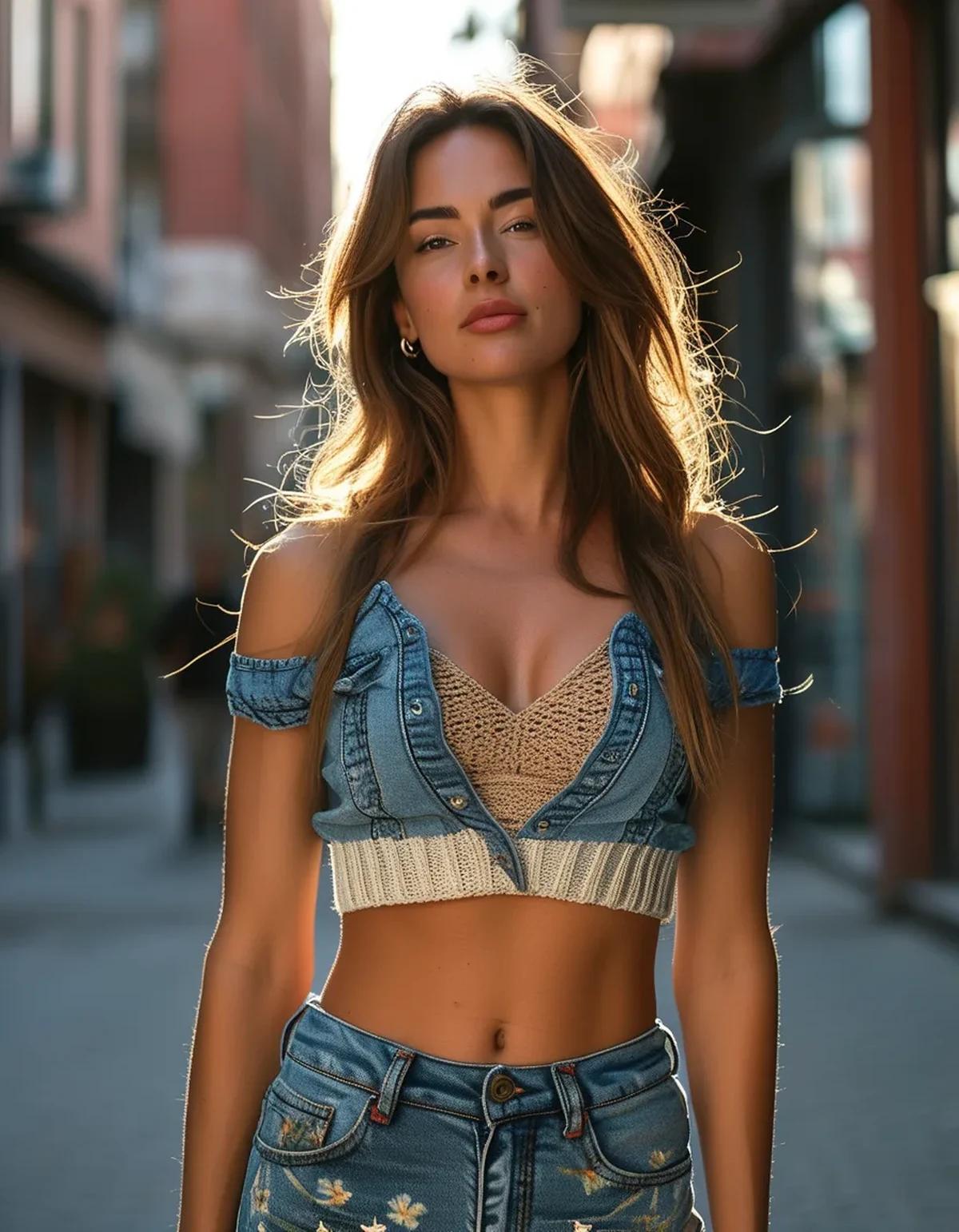
What about the pockets and stitching?
The details that decide it at close range.
Back pockets are the strongest single signal. Real jean back pockets sit at a specific height and width relative to the seat - roughly at the fullest part, with a gap between them.
What goes wrong:
- Printed-on pockets with no dimension. From more than a few feet they read as a flat shape, because real pockets cast a shadow at the edge
- Pockets positioned too low, which is the most common error and immediately reads as wrong
- Pockets too small, which happens when a pattern is scaled from a smaller size
Applied pockets - actual fabric patches stitched on - are considerably more convincing than printed ones, because the edge shadow is real. Some versions include functional pockets, which is both more convincing and more useful.
Topstitching is the other close-range detail. Real denim has contrast topstitching in a gold or tan thread, along the outseam, inseam, yoke and pocket edges.
What works: actual contrast stitching, or a very well-executed print that follows realistic seam geometry.
What does not: printed stitch lines that run where no seam would be, or stitching that does not follow the back yoke - the V-shaped seam across the seat that every pair of jeans has and most printed leggings omit entirely. Its absence is subtle and it is one of the things that makes a print look flat.
Then the waistband. A wide stretch band with a visible elastic edge announces legging immediately. The convincing versions use a flat waistband with a printed or applied fly detail and belt loops. Belt loops are disproportionately effective, because nothing signals trouser more clearly.
Myth vs Fact: Denim-Look Leggings
Myth: Expensive ones always look more real. Fact: Price correlates with fabric quality and durability, not with print realism. Some mid-range versions have better pocket placement and matte finish than premium ones. Judge the five details, not the tag.
Myth: Jeggings and denim-print leggings are the same thing. Fact: Jeggings are usually made from actual stretch denim - cotton with elastane - and behave more like jeans. Denim-print leggings are performance knit with a print. Jeggings look more real and stretch less; leggings move better and look less real.
Myth: A darker wash always looks more convincing. Fact: Dark washes are more forgiving, which is not the same as more convincing. A well-executed medium wash with real fade detail can look better - it is just harder to get right.
Myth: You cannot wear them for actual exercise. Fact: Performance-knit versions are functionally leggings and work fine for training. Whether you want to is a style question. Jeggings genuinely do not work for exercise because cotton holds moisture.
Myth: Nobody can tell. Fact: At conversational distance, a good pair genuinely passes. At close range, the finish and stitching are visible. The realistic goal is passing at social distance, not fooling someone across a table.
FAQ: Denim-Look Legging Questions, Answered
Can I wear them to the office?
Depends on the office, and the same way jeans would. If jeans are acceptable, a matte dark-wash pair with a structured top and non-athletic shoes generally reads fine. If jeans are not acceptable, these will not be either.
How do I stop them fading unevenly for real?
Wash inside out in cold water, avoid fabric softener, and air dry. Printed fabrics lose print integrity in heat, and tumble drying is the fastest way to make a good pair look cheap.
Do they transfer colour onto light furniture?
Good ones do not, and cheaper prints occasionally do on first wears, particularly in humid weather when there is more moisture involved. Washing before first wear and testing against a white cloth is a sensible precaution.
Are the pockets ever functional?
Sometimes - better versions include real back pockets, and some include a hidden waistband pocket. Functional back pockets are more convincing visually, and loaded pockets pull the waistband down on that side.
What top works best with them?
Something with structure and a defined hem - a tucked knit, a fitted shirt, a cropped jacket. The combination that reads least convincingly is a long loose top, because it hides the waistband and pocket details that do the work of making them look like trousers.
TL;DR:
- Sheen is the fastest giveaway - look for matte, brushed or textured finishes, and check for a bright highlight down the thigh in product photos
- Uniform colour reads as printed fabric; subtle fade at the knee and along seams reads as denim
- Back pocket placement is the strongest close-range signal, and too low is the common error
- Applied pockets beat printed ones because the edge shadow is real
- Belt loops and a flat waistband with a fly detail do more than anything else to read as trouser
- The realistic goal is passing at conversational distance, not fooling someone across a table
Five details, all visible in a product photo, none of them correlated with price.
See It in Motion
Seen here: High Waist Embossed Yoga Leggings with Side Pockets — shop it on bubblelime.com
Keep Reading
This article is for general informational and styling purposes only. Fit, sizing, and product availability may vary.
